Baltimore Ravens Uniforms Face Harsh Criticism as Fans and Analysts Deliver Blunt Assessment of Team’s Iconic Game Day Look
The Baltimore Ravens have long been known for their fierce play, intimidating defense, and championship pedigree, but when it comes to aesthetics, particularly their uniforms, the franchise has found itself on the receiving end of some brutal honesty. In a recent national ranking of all 32 NFL uniforms by a panel of analysts, fans, and design experts, the Ravens’ uniforms were handed a surprisingly rough label: uninspired, outdated, and “too safe.” The critique has sparked a lively and at times divisive debate in Baltimore and across the NFL, raising deeper questions about tradition, innovation, and the visual identity of a franchise that has become synonymous with physical, hard-nosed football.
The label came from a high-profile annual report on NFL uniforms conducted by a prominent sports media outlet, which ranked the Ravens in the bottom third of the league in terms of visual appeal. The article described Baltimore’s primary look as “visually stiff and lacking in innovation,” with some panelists calling it “a missed opportunity to reflect the ferocity and legacy of the team.” While the critique didn’t question the franchise’s success or brand power, it pulled no punches when it came to the Ravens’ on-field appearance.
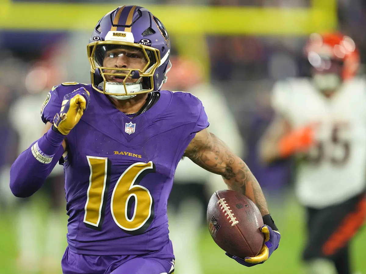
This stinging evaluation has touched a nerve among Ravens fans—many of whom take great pride in the team’s visual identity, particularly the purple-and-black color scheme that has become iconic since the team’s establishment in 1996. To supporters, the combination of regal purple, coal black, and metallic gold represents a unique, powerful visual signature that captures the team’s fierce personality and storied history. But to critics, the uniform design feels trapped in the early 2000s, with minimal evolution or experimentation over the past two decades.
The ranking slammed the Ravens’ current home and away combinations as “serviceable but forgettable,” and went even further in criticizing the team’s alternate uniforms, including their black-on-black set, which was described as “edgy for its time but now dated and overused.” One particularly harsh critic commented, “Baltimore’s look hasn’t aged well. It’s a jersey that screams 2004 and hasn’t moved on.”
Such blunt assessments are hard to swallow for a franchise that has carefully cultivated a tough, blue-collar image built around defense and resilience. But perhaps the most telling element of this criticism isn’t the aesthetics themselves, but how the Ravens have largely stayed static while other teams around the league have embraced bold redesigns and alternate concepts. From the Los Angeles Chargers’ electric blue rebrand to the Miami Dolphins’ sleek minimalist overhaul, teams across the NFL have begun to see uniforms as essential elements of branding and fan engagement in a highly visual, social media–driven era.
Baltimore, by contrast, has made only minor tweaks to its uniform template over the years—primarily adjustments to stripe widths, number fonts, and the occasional color rush or throwback night. While the traditionalist approach has earned respect from some quarters for maintaining continuity and identity, others argue that the lack of evolution signals stagnation.
Still, not everyone is in agreement with the panel’s verdict. Many fans and former players have come to the defense of the Ravens’ uniforms, arguing that the criticism misses the point of what Baltimore football is all about. Hall of Famer Ed Reed, a living legend in Ravens lore, once called the purple jerseys “a badge of honor” and said wearing them “made you feel like you were stepping onto the battlefield.” For some, the toughness, simplicity, and recognizable silhouette of the Ravens uniform is what makes it timeless—not tired.
On social media, debate broke out immediately after the rankings were released. Some Ravens fans echoed the critics, saying it was time for a modern refresh—perhaps something more aggressive or dynamic that reflects the franchise’s evolution into a perennial playoff threat. Others doubled down in support of the current design, pointing to its uniqueness in a league where many teams often look similar due to shared color schemes or overly modern templates.
The internal conversation in Baltimore has reportedly reached the front office as well. While the Ravens organization has made no official statement regarding the rankings, sources close to the team say that marketing and branding departments have taken note of the growing discourse. There are whispers that a uniform redesign could be under discussion for the coming seasons, especially as the NFL continues to relax restrictions on alternate uniforms and helmet designs.
If a change is coming, it would represent a significant moment in the franchise’s identity. The Ravens have worn their current base design, with minor tweaks, for nearly 20 years—a testament to stability and tradition in an ever-changing league. But the potential for a refresh also opens up opportunities: to connect more with younger fans, to reflect the next generation of Baltimore football stars like Lamar Jackson and Kyle Hamilton, and to reassert the franchise’s dominance not only in performance but also in visual presence.
Design experts weighing in on the Ravens’ look point to several areas for potential improvement. One common suggestion is a complete reimagining of the team’s alternate sets, possibly incorporating more gold or emphasizing the raven feather motif that is subtly used in promotional materials but absent from the uniform itself. Others recommend modernizing the typeface, resizing the sleeve logos for better proportions, or creating a sleek blackout look that feels intentional and less like a leftover template from the past decade.
Interestingly, while the uniforms received harsh reviews, the team’s logo and helmet design fared much better in the rankings. The winged “B” and the stylized raven head continue to be praised for their originality and intensity. The black helmet with the purple sheen remains one of the most feared and admired visuals in the NFL. But critics argue that the jersey and pants design have failed to keep pace with the excellence of the helmet, creating a disjointed overall visual identity.
Despite the criticism, there is a silver lining. Attention to aesthetics in football is often reserved for offseasons, but uniform discourse is increasingly part of fan engagement and marketing strategy. The fact that the Ravens are even in the discussion is a sign of the team’s prominence and the passionate connection fans feel to the brand. Every visual element—from helmet to socks—contributes to the story a franchise tells its supporters, and Baltimore’s story has always been about grit, toughness, and unapologetic intensity.
As the NFL continues to evolve, the intersection between tradition and innovation becomes more critical. Teams must strike the right balance between honoring their legacy and embracing the visual trends of the modern sports landscape. For the Ravens, the question now becomes whether they’re ready to make that leap—or whether they’ll double down on the identity that has brought them so much success.
In the meantime, the criticism has added an unexpected storyline to the upcoming season. As the Ravens chase another AFC North title and a possible Super Bowl run, fans and analysts alike will be watching to see if changes are hinted at or teased throughout the year. Will Baltimore take the critiques to heart? Or will they let the results on the field speak louder than any fashion review?
Only time will tell, but one thing is certain: the conversation about Baltimore’s uniforms has been slapped with a rough label—and it’s not going away quietly.


