Indiana Pacers Unveil Stunning 2026 City Edition Uniforms: A Bold Modern Twist on Their Beloved 1980s Hardwood Classics
The Indiana Pacers have officially revealed their 2025-2026 City Edition uniforms—and they’re turning heads across the NBA. Drawing direct inspiration from the franchise’s iconic 1980s threads, the new look is a dazzling fusion of retro aesthetics and modern design, marrying nostalgia with innovation in a way that feels unmistakably Indiana.
The uniforms, which made their debut in a special unveiling event at Gainbridge Fieldhouse, mark a bold return to the Pacers’ golden age look—a time when slick passes, blue-collar defense, and relentless hustle defined basketball in the Hoosier state. The 1980s weren’t the Pacers’ most successful decade in terms of wins and losses, but they were formative. They saw the team grow its identity, establish a fan base in the NBA after its ABA years, and lay the foundation for what would later become one of the Eastern Conference’s most resilient franchises.
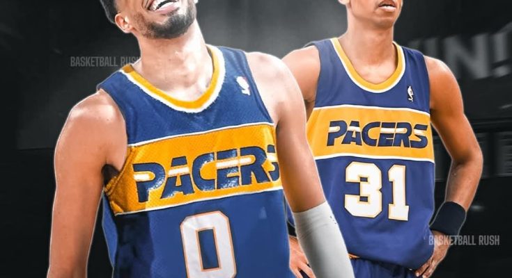
The 2026 City Edition uniform features the same vibrant royal blue base color that dominated the 1980s jerseys, but with a sharper, cleaner finish using today’s high-performance materials. The iconic yellow “PACERS” wordmark returns across the chest—bold, blocky, and unmistakably vintage—but reimagined with modernized edges and updated font spacing that gives the jersey a sleeker feel on today’s court.
One of the most talked-about features of the updated uniform is the reintroduction of the diagonal stripe pattern that originally ran down the side of the shorts and jerseys in the late ’80s. That design element, which has long been a fan favorite, is back with a twist—now rendered with reflective threading that glimmers under arena lights, making the players pop visually in both in-person and broadcast settings.
The shorts are equally faithful to the throwback theme, sporting the classic Pacers “P” logo on the waistband, framed in a newly introduced silver trim. It’s a subtle addition, but one that nods to the franchise’s evolution and its aspirations for the future. Silver, a color not heavily used in past uniforms, represents the modern edge of the City Edition concept—a balance between the franchise’s proud past and its forward-looking identity.
According to Pacers President of Basketball Operations Kevin Pritchard, the idea behind the 2026 City Edition uniforms was “honoring where we’ve been while showing where we’re going.”
“Our fan base has so much pride in our history—Reggie, Rik Smits, the Davis boys, all the battles at Market Square Arena,” Pritchard said. “We wanted to pay tribute to those roots, but also give our guys something that felt powerful and modern. When you put on this jersey, you’re wearing Indiana’s story.”
The player reaction has been overwhelmingly positive. Tyrese Haliburton, the team’s All-Star point guard and leader of the new generation, was among the first to don the new gear during the media shoot. “This is fire,” Haliburton said with a grin. “It feels like old-school Pacers, but with a little extra sauce. I love it.”
Bennedict Mathurin, expected to make a major leap this season, echoed the sentiment. “The blue and yellow already means a lot to us, but this design? This makes you want to play hard, rep Indy with pride. We’re putting on for the people who wore it before us, and that means something.”
The uniforms were designed in collaboration with Nike and a select group of Indianapolis-based artists and designers, giving the City Edition kit a uniquely local flavor. One standout feature is the inclusion of a small “Circle City” tag stitched near the bottom hem of the jersey—a subtle but meaningful reference to Indianapolis’ nickname and civic pride.
Another easter egg tucked into the design is a pattern within the numbering—if you look closely, the background texture of each numeral is composed of miniature outlines of Indiana’s 92 counties. It’s a symbolic nod to the state’s basketball legacy, from small-town gyms to big-stage arenas.
This isn’t the first time the Pacers have dabbled in retro-inspired City Edition uniforms. In recent years, they’ve leaned into their ABA roots, highlighted racing themes reflective of the Indianapolis 500, and even paid tribute to civic architecture. But this season’s effort may be the most direct embrace of nostalgia yet, and perhaps the most successful in terms of execution.
Longtime fans are already calling it one of the franchise’s best alternate uniforms to date. “When I saw it, I immediately thought of Clark Kellogg and Herb Williams,” said Dennis, a season-ticket holder since 1982. “This is what the Pacers looked like when I first fell in love with the team. But somehow, it doesn’t feel dated—it feels fresh. I can’t wait to see it under the lights.”
The uniform will make its on-court debut during the first week of the regular season when the Pacers host the Miami Heat at Gainbridge Fieldhouse. The team plans to wear the City Edition look for 10 home games and four nationally televised away games during the 2025-26 season. There are also discussions of coordinating themed nights around each of those games, complete with retro music, video packages, and appearances from former players.
Reggie Miller, the Pacers legend whose prime came after the era being honored, has also given his blessing. “The ‘80s Pacers had a style all their own,” Miller said during a phone interview with Bally Sports Indiana. “They weren’t the most dominant team, but they had heart—and they set the stage for what was coming. I love that the team is showing that respect and giving it a 2025 twist.”
Merchandise sales are already booming. The Pacers’ official online store reported a massive spike in jersey pre-orders within the first 24 hours of the announcement, with Haliburton’s No. 0 and Mathurin’s No. 00 leading the pack. Retailers across Indianapolis are preparing for an influx of demand as the season approaches.
It’s not just about style, either. The new uniforms incorporate Nike’s most advanced performance technology yet. The Dri-FIT ADV fabric helps regulate temperature and manage moisture, providing players with peak performance comfort during games. Each jersey is also made using 100% recycled polyester, part of Nike’s Move to Zero campaign focused on sustainability in sportswear.
While uniforms alone don’t win championships, they can signal a team’s identity—and this one is crystal clear. The Pacers are embracing their past, celebrating their culture, and boldly stepping into a new era led by a talented, hungry core.
For head coach Rick Carlisle, who grew up watching the NBA in the 1980s, the look is more than just a fashion statement. “This is a visual reminder of the grind, the toughness, the blue-collar mentality this franchise was built on,” he said. “I want our guys to wear it with pride—and compete with that same spirit.”
The City Edition uniform also arrives at a critical juncture for the Pacers, a team on the cusp of serious Eastern Conference contention. With Haliburton entering his prime, Mathurin emerging, and a retooled roster ready to make noise, the uniform feels like a rallying cry.
Fans and analysts alike see the new jersey as symbolic of the franchise’s return to relevance—a “rebrand” that stays true to its roots while fueling hopes for postseason glory.
Only time will tell whether the 2025-26 season brings a playoff run or something even more special. But one thing’s for sure: the Pacers will look good doing it. Very good.
The 2026 City Edition uniforms are a love letter to Indiana basketball, a statement of identity, and a glimpse of where the Pacers are headed. For a team steeped in tradition and powered by youthful energy, this fusion of old and new might be just the spark the Circle City needs.
ARTICLE:
The Indiana Pacers have officially revealed their 2025-2026 City Edition uniforms—and they’re turning heads across the NBA. Drawing direct inspiration from the franchise’s iconic 1980s threads, the new look is a dazzling fusion of retro aesthetics and modern design, marrying nostalgia with innovation in a way that feels unmistakably Indiana.
The uniforms, which made their debut in a special unveiling event at Gainbridge Fieldhouse, mark a bold return to the Pacers’ golden age look—a time when slick passes, blue-collar defense, and relentless hustle defined basketball in the Hoosier state. The 1980s weren’t the Pacers’ most successful decade in terms of wins and losses, but they were formative. They saw the team grow its identity, establish a fan base in the NBA after its ABA years, and lay the foundation for what would later become one of the Eastern Conference’s most resilient franchises.
The 2026 City Edition uniform features the same vibrant royal blue base color that dominated the 1980s jerseys, but with a sharper, cleaner finish using today’s high-performance materials. The iconic yellow “PACERS” wordmark returns across the chest—bold, blocky, and unmistakably vintage—but reimagined with modernized edges and updated font spacing that gives the jersey a sleeker feel on today’s court.
One of the most talked-about features of the updated uniform is the reintroduction of the diagonal stripe pattern that originally ran down the side of the shorts and jerseys in the late ’80s. That design element, which has long been a fan favorite, is back with a twist—now rendered with reflective threading that glimmers under arena lights, making the players pop visually in both in-person and broadcast settings.
The shorts are equally faithful to the throwback theme, sporting the classic Pacers “P” logo on the waistband, framed in a newly introduced silver trim. It’s a subtle addition, but one that nods to the franchise’s evolution and its aspirations for the future. Silver, a color not heavily used in past uniforms, represents the modern edge of the City Edition concept—a balance between the franchise’s proud past and its forward-looking identity.
According to Pacers President of Basketball Operations Kevin Pritchard, the idea behind the 2026 City Edition uniforms was “honoring where we’ve been while showing where we’re going.”
“Our fan base has so much pride in our history—Reggie, Rik Smits, the Davis boys, all the battles at Market Square Arena,” Pritchard said. “We wanted to pay tribute to those roots, but also give our guys something that felt powerful and modern. When you put on this jersey, you’re wearing Indiana’s story.”
The player reaction has been overwhelmingly positive. Tyrese Haliburton, the team’s All-Star point guard and leader of the new generation, was among the first to don the new gear during the media shoot. “The Indiana Pacers have officially revealed their 2025-2026 City Edition uniforms—and they’re turning heads across the NBA. This is fire,” Haliburton said with a grin. “It feels like old-school Pacers, but with a little extra sauce. I love it.”
Bennedict Mathurin, expected to make a major leap this season, echoed the sentiment. “The blue and yellow already means a lot to us, but this design? This makes you want to play hard, rep Indy with pride. We’re putting on for the people who wore it before us, and that means something.”
The uniforms were designed in collaboration with Nike and a select group of Indianapolis-based artists and designers, giving the City Edition kit a uniquely local flavor. One standout feature is the inclusion of a small “Circle City” tag stitched near the bottom hem of the jersey—a subtle but meaningful reference to Indianapolis’ nickname and civic pride.
Another easter egg tucked into the design is a pattern within the numbering—if you look closely, the background texture of each numeral is composed of miniature outlines of Indiana’s 92 counties. It’s a symbolic nod to the state’s basketball legacy, from small-town gyms to big-stage arenas.
This isn’t the first time the Pacers have dabbled in retro-inspired City Edition uniforms. In recent years, they’ve leaned into their ABA roots, highlighted racing themes reflective of the Indianapolis 500, and even paid tribute to civic architecture. But this season’s effort may be the most direct embrace of nostalgia yet, and perhaps the most successful in terms of execution.
Longtime fans are already calling it one of the franchise’s best alternate uniforms to date. “When I saw it, I immediately thought of Clark Kellogg and Herb Williams,” said Dennis, a season-ticket holder since 1982. “This is what the Pacers looked like when I first fell in love with the team. But somehow, it doesn’t feel dated—it feels fresh. I can’t wait to see it under the lights.”
The uniform will make its on-court debut during the first week of the regular season when the Pacers host the Miami Heat at Gainbridge Fieldhouse. The team plans to wear the City Edition look for 10 home games and four nationally televised away games during the 2025-26 season. There are also discussions of coordinating themed nights around each of those games, complete with retro music, video packages, and appearances from former players.
Reggie Miller, the Pacers legend whose prime came after the era being honored, has also given his blessing. “The ‘80s Pacers had a style all their own,” Miller said during a phone interview with Bally Sports Indiana. “They weren’t the most dominant team, but they had heart—and they set the stage for what was coming. I love that the team is showing that respect and giving it a 2025 twist.”
Merchandise sales are already booming. The Pacers’ official online store reported a massive spike in jersey pre-orders within the first 24 hours of the announcement, with Haliburton’s No. 0 and Mathurin’s No. 00 leading the pack. Retailers across Indianapolis are preparing for an influx of demand as the season approaches.
It’s not just about style, either. The new uniforms incorporate Nike’s most advanced performance technology yet. The Dri-FIT ADV fabric helps regulate temperature and manage moisture, providing players with peak performance comfort during games. Each jersey is also made using 100% recycled polyester, part of Nike’s Move to Zero campaign focused on sustainability in sportswear.
While uniforms alone don’t win championships, they can signal a team’s identity—and this one is crystal clear. The Pacers are embracing their past, celebrating their culture, and boldly stepping into a new era led by a talented, hungry core.
For head coach Rick Carlisle, who grew up watching the NBA in the 1980s, the look is more than just a fashion statement. “This is a visual reminder of the grind, the toughness, the blue-collar mentality this franchise was built on,” he said. “I want our guys to wear it with pride—and compete with that same spirit.”
The City Edition uniform also arrives at a critical juncture for the Pacers, a team on the cusp of serious Eastern Conference contention. With Haliburton entering his prime, Mathurin emerging, and a retooled roster ready to make noise, the uniform feels like a rallying cry.
Fans and analysts alike see the new jersey as symbolic of the franchise’s return to relevance—a “rebrand” that stays true to its roots while fueling hopes for postseason glory.
Only time will tell whether the 2025-26 season brings a playoff run or something even more special. But one thing’s for sure: the Pacers will look good doing it. Very good.
The 2026 City Edition uniforms are a love letter to Indiana basketball, a statement of identity, and a glimpse of where the Pacers are headed. For a team steeped in tradition and powered by youthful energy, this fusion of old and new might be just the spark the Circle City needs.


