Scarlet Flash and Chrome Dreams: Ranking Ohio State Football’s Most Iconic Alternate Uniforms From Past Eras to Modern Glory
When it comes to college football, few programs boast a legacy as rich and tradition-heavy as Ohio State. The scarlet and gray are iconic, with Buckeye leaves and the Block “O” representing not just a university but a state-wide passion. But over the years, the Buckeyes have flirted with change—introducing alternate uniforms that have stirred emotions, sparked debates, and brought visual energy to some of the program’s most memorable Saturdays. From sleek modern takes to vintage throwbacks that honored decades of excellence, Ohio State’s alternate uniforms have evolved from rare novelties to anticipated spectacles. While the core colors have remained, Nike’s partnership with the Buckeyes has led to creative reinterpretations that have reshaped what it means to “look like Ohio State” on game day. These alternate uniforms aren’t just about looking good on the field—they carry symbolism, cultural weight, and a dose of intimidation. Here’s a 1500-word ranking and retrospective of the greatest, boldest, and most unforgettable alternate uniforms in Ohio State football history.
The 2010 “Pro Combat” uniform that debuted against Michigan is widely regarded as the moment Ohio State’s alternate uniform era truly began. With subtle gray camo details and blockier numbers reminiscent of the 1942 national championship team, this look connected historical reverence with modern edge. The throwback element struck a chord with fans, while the tight-fit “Pro Combat” design gave players a cutting-edge feel. Worn in a 37-7 win over Michigan, it was a statement both on the scoreboard and visually. From then on, alternate uniforms would become an annual spectacle.
In 2011, Ohio State took things even further back in time, wearing throwbacks to honor the 1961 national championship team. These unis were clean, classic, and carried the weight of tradition. The helmet, featuring a wide gray stripe and thicker numbers on the side, gave off an old-school NFL vibe. The pants had no stripes, the socks were high, and the jerseys had a retro simplicity that made them instantly memorable. What elevated these above simple nostalgia was how authentic they felt—not gimmicky, just pure football history brought to life.
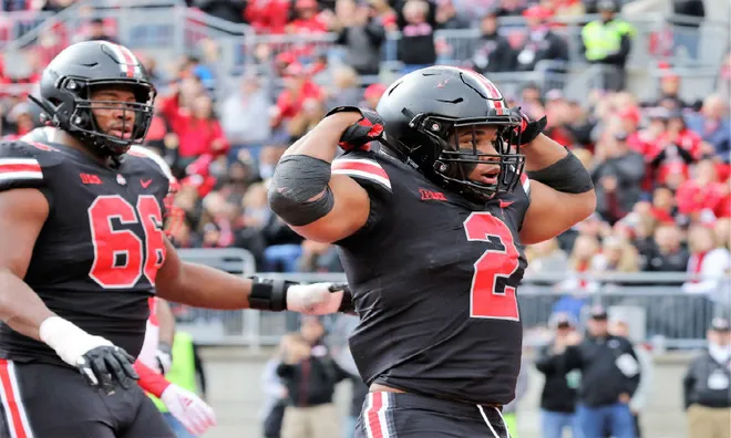
Fast forward to 2014, and the Buckeyes stepped into a darker territory—literally—with the “Blackout” alternate. While not worn until 2015 in a 38-10 win over Penn State, the concept was first teased during the championship run. The all-black uniforms with scarlet numbers and chrome Buckeye leaf decals on a black helmet marked a bold shift. For a team that had long resisted black as a primary color, this uniform felt rebellious yet powerful. The fans responded with energy, and the team backed it up with dominant play. Ohio Stadium under the lights, packed with fans clad in black, became a scene from a football fever dream.
Perhaps no alternate uniform generated more mixed emotions than the 2016 gray-on-gray set, sometimes dubbed the “Land of Wolves” look. This outfit, entirely made up of various gray tones with black and scarlet accents, represented a daring departure from the norm. The helmet featured a metallic sheen, the jersey numbers had a claw-scratch texture, and the uniforms overall had a gladiator-like feel. While some fans were turned off by the lack of scarlet and white, others admired the futuristic, almost battlefield-ready vibe. Ohio State’s 62-3 dismantling of Maryland that day only added to the mystique.
In contrast, the 2017 all-white “Whiteout” look worn against Michigan in the Big House was a masterclass in simplicity and contrast. With silver helmets and white pants, the look was icy, sharp, and turned a rivalry game into a fashion show. The white-on-white ensemble highlighted how clean and intimidating a minimalist design could be, especially when paired with a performance that resulted in a 31-20 victory over the Wolverines. The all-white approach worked beautifully as an away-game statement, letting the Buckeyes visually dominate in enemy territory.
2019 brought arguably one of the most talked-about alternates in school history: the return of the all-black uniform, this time with red gloves and socks for added flair. Worn in a blowout win over Michigan State, the look was even more refined than its 2015 predecessor. The helmet had a shimmering finish, the Buckeye leaf decals popped against the black background, and the streamlined look emphasized speed and strength. The fan base fully embraced the blackout, and it became a visual embodiment of Ohio State’s aggressive, take-no-prisoners style of play.
For those who prefer nostalgia over novelty, the 2019 throwback worn against Wisconsin to honor the 150th anniversary of college football was a showstopper. These uniforms mimicked the 1950s look, complete with horizontal sleeve stripes, simple helmets, and retro fonts. In a game that pitted two powerhouse programs against each other, the classic look brought dignity and reverence to the gridiron. The aesthetics captured the roots of the sport while allowing Ohio State’s athleticism to shine in a 38-7 win.
The 2021 “Rushmen” alternate look broke the mold with black jerseys, scarlet pants, and a throwback feel to the 1990s swagger era. It was a nod to the aggressive defensive line, nicknamed the Rushmen, and featured a black helmet that gave the players an extra edge. It was bold, slightly chaotic, and embraced the idea that intimidation can start before the first snap. Though not universally loved, the look resonated with the younger generation and reflected a sense of identity from the Silver Bullets defensive legacy.
Then there’s the 2022 “Scarlet the Shoe” uniform, which leaned fully into the color that defines Ohio State. With a scarlet jersey, scarlet pants, and a red helmet featuring white numbers, it was the first time the Buckeyes had gone all-in on one color to such a degree. Against Wisconsin, the uniform sparked a visual explosion, matched only by Ohio State’s dominant performance on the field. Some fans argued it was too much red, while others saw it as a long-overdue homage to the Buckeyes’ core identity. Regardless, it made a lasting impression.
A special mention must go to the 2018 alternate worn against Nebraska—a sleek black-and-scarlet hybrid with military undertones. Meant to honor veterans and active-duty service members, the look featured subtle flag patches and a no-nonsense black helmet. It wasn’t as flashy as some others, but the meaning behind it, and the pride with which the players wore it, made it one of the most respected alternate uniforms Ohio State has donned.
It’s impossible to talk about Ohio State alternate uniforms without mentioning the fan response over the years. Social media explodes each time Nike unveils a new design. Debates ensue about tradition versus innovation, about respecting the sacred scarlet and gray versus exploring new boundaries. Some fans are purists who believe Ohio State should always look like Ohio State—block numbers, gray stripes, and nothing too fancy. Others see the alternate uniforms as a way to excite recruits, inject energy into the season, and give the program a fresh look for a new generation.
Even the players have voiced opinions over the years. Alumni like Ezekiel Elliott, Joey Bosa, and C.J. Stroud have praised the alternates for giving them an emotional boost before kickoff. The uniforms may not affect the outcome of the game directly, but there’s no denying the psychological edge that can come from feeling like you’re wearing armor fit for battle.
In recent years, Ohio State has struck a balance. Alternates have become more strategic—reserved for big games or moments that need a spark. The designs continue to evolve but almost always retain a link to Ohio State’s past. Whether it’s in the helmet decals, the font of the numbers, or the spacing of the stripes, the essence of Ohio State football remains intact.
Ultimately, ranking these uniforms comes down to impact. Some delivered visual wow-factor but fell flat in performance. Others were subtle but accompanied by statement victories that etched them into Buckeye lore. The best ones accomplished both—making fans lean in during the broadcast and leaving a lasting mark in Ohio State history.
Whether you love the throwbacks that honor legends or crave the sleek futurism of all-black designs, Ohio State’s alternate uniforms have carved their own legacy. They’ve become part of the story, part of the celebration, part of the intimidation. With every unveiling, the excitement surges again—not just for what the Buckeyes will wear, but for what they’ll do while wearing it. In Columbus, tradition and innovation don’t clash. They coexist, on a 100-yard canvas, week after week.


