Warriors Return with Stunning Cream-Colored Uniform Celebrating Bay Area Identity in Spectacular Style
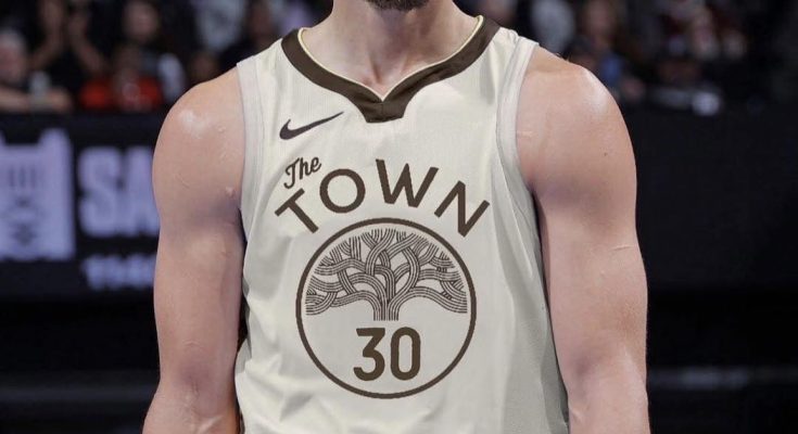
The upcoming season, Golden State Warriors fans are about to witness a fresh yet nostalgic twist: the team’s highly anticipated cream-colored classic jersey. Designed as a modern tribute to the Bay Area legacy, this striking cream uniform is set to make waves both on the court and in the fashion world of sports.
Drawing inspiration from past throwbacks and regional symbols, the cream jersey looks to blend retro sensibilities with contemporary flair. Many sources suggest the Warriors’ 2025‑26 City Edition design will adopt a primary cream base accented with deep brown and trimmed in gold—echoing local brick heritage and earthy tones symbolic of Oakland’s famed oak trees . If the leaked mock‑ups hold true, this uniform channels a refined, understated elegance.
The Warriors’ uniform design process is thorough—taking years to finesse, collaborating with Nike, designers, and the team’s marketing leaders like Amanda Chin to craft pieces that honor both identity and innovation . This dedication ensures that a cream uniform isn’t just aesthetic but emblematic: it reflects the story of the Bay Area, its architecture, history, and spirit.
Historically, Golden State has used “cream” tones in a few retro jerseys—such as the “We Believe” and older Baron Davis eras but this season marks a more refined return to that palette. Fans and collectors alike are thrilled for this elevated neutral look that carries depth without overwhelming brightness.
The rumored cream uniform appears to echo the Golden State spirit in a timeless way: bold lettering, crisp striping, and subtle hues of gold or red trim, much like past Philadelphia‑era whites and navy City Editions but with a warmer tone . That white Classic Edition jersey, released during the 2024‑25 season, paid homage to early franchise history with red and gold outline, offering a precursor to this new cream one .
Social media reactions to past City mockups have been polarized. One user bluntly stated “Trash” about earlier designs and felt they lacked meaningful symbolism, contrasting with fans who embrace jerseys steeped in local art and heritage . With the cream design’s evident nod to regional materials and iconic oak trees, this uniform may avoid past criticisms by rooting the aesthetic in tangible local identity.
What could we expect from this cream edition on game days? A harmonious pairing with navy or midnight blue shorts trimmed in gold or brown piping. The font might evoke vintage styles—perhaps block lettering or retro script—while branding accents like The Town oak tree or Bay Bridge cable motifs could subtly appear on the waistband or shoulder panels .
Beyond aesthetics, choosing cream signals a broader design evolution—one that favors nuanced storytelling over flashy launches. It aligns with broader NBA trends like the Bucks reintroducing their “Cream City” uniforms in homage to Milwaukee’s brick architecture . For Golden State, cream becomes a canvas to express the connection between team and city.
Players often weigh in. Amanda Chin noted that Stephen Curry and Jordan Poole have significant input into uniform design choices. And Steph famously called NBA Commissioner Silver to bring back a classic uniform one last time at Oracle Arena—resulting in an emotionally powerful moment for fans . If this cream look receives player endorsement early, fans will likely embrace it even more enthusiastically.
Fan polls repeatedly reward classic designs: “The City” from 1966 topped a Chronicle poll with 27.2% of votes, followed by the Bay Bridge and Town jerseys . Given the heritage vibe of a cream uniform, this design could climb the charts quickly if executed with thoughtful nods to history.
Merchandising is bound to follow suit. A cream-edition jersey lends itself well to lifestyle apparel—hoodies, caps, tees—thanks to its neutral but distinctive base tone. It invites crossover into fashion circles without drifting into flashy territory.
On the court, the uniform is expected to debut midseason, most likely as the official City Edition look, worn during special Bay Area themed games or Rivals nights. The corresponding court design might feature subtle cream highlights, oak tree motifs or regional map outlines, enhancing visual cohesion between gear and venue.
This uniform isn’t merely about aesthetics—it’s a narrative. It channels origins, geography, and culture. It connects to materials (like cream-colored brick), to landmarks (oak trees of Oakland, cable cars of San Francisco), and to eras (Philadelphia roots, Oakland legacy, modern Bay Area identity). The cream base is warm, inviting, and flexible—a perfect backdrop for layered symbolism.
If the leaked mockup images reflect the real thing, fans can look forward to a masterpiece in minimalism: no loud electric hues, but rich texture in typography and trim. Gold edging, dark brown stacked stripes, color‑shadow numbering—all balancing simplicity with meaning.
Whether worn by Curry, Kuminga, Green, or Podziemski, it offers a fresh uniform chapter while honoring decades of heritage. The color story is clear: cream for history, brown for roots, gold for excellence. Together they evoke more than a jersey—they evoke a region, a legacy, a basketball culture deeply tied to place.
In summary, the Warriors’ cream uniform for the upcoming season—if it lives up to early previews—promises a visual identity that is refined, rooted, and resonant. Far from being a simple throwback, it appears to be a thoughtful synthesis of design, art, heritage, and basketball prestige. Fans can anticipate a jersey that feels right, that tells a story, and that may soon become one of the franchise’s most beloved looks in years to come.
Whether you wear it to the game or hang it on the wall, the cream uniform seems poised to embody the soul of Golden State basketball: timeless, proud, and true to its Bay Area roots.


